SOFIA HELSINKI
Visual identity for a charming and unique venue for co-working, dining, drinks and events.
CHALLENGE
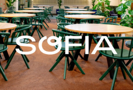
Sofia is a place in the beautiful surroundings of the historic Torikorttelit area in Helsinki, offering charming, unique, and inspiring spaces for co-working, events, food, and drinks.
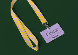
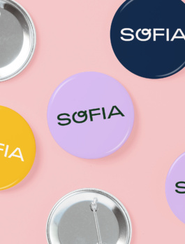
With the new owners taking over the place recently, the aim is to make Sofia even more attractive, comfortable, and inspiring for its members, guests, and staff. To support the goals set for Sofia, a stronger and more recognizable visual identity was needed. Kokoro & Moi was responsible for the work, ranging from visual identity and guidelines to the design of visual communication materials (online and offline), spatial implementations, and branded products.
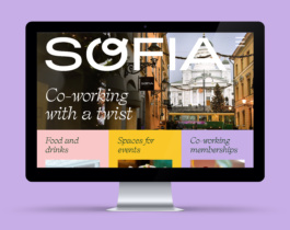
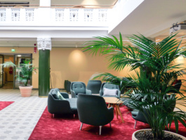
The new visual identity gets inspiration from the unique and inspiring milieu of Sofia, and its friendly, curious and positive atmosphere.
APPROACH
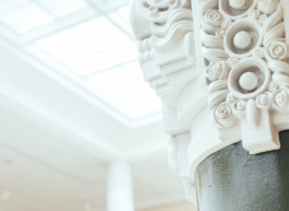
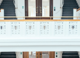
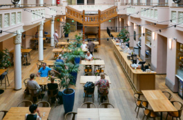
Curious, positive, kind, and open were the keywords when the new owners took over Sofia and began to develop it. They wanted Sofia to be a place where everyone could feel welcome and be inspired by a positive and enterprising atmosphere. When located in 250 years old architectural beauty, Sofia's milieu is unique, providing a charming and inspiring setting for people to work, meet, dine, and have a good time together.
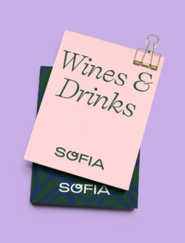
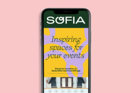
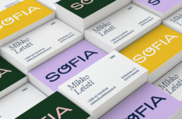
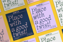
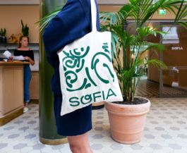
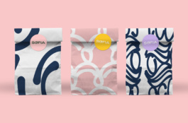
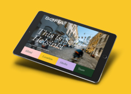
These starting points offered good opportunities for finding a meaningful direction for the new visual identity. The logo with a loop at the letter "O" communicates the "good twist" of the place. The color palette is derived from the building and interiors and complemented by a couple of fresh shades. Illustrations became the recognizable element of the identity. The abstract hand-drawn patterns, inspired by the decorative details of Sofia’s architecture, bring personality and character to the identity.
Typography is an alliance of three different fonts, offering possibilities for playful and versatile text styling and layouts. Self Modern, with its italic cut, reflects the architecture and milieu of the place and is used for single words and short sentences. Self Modern takes turns with a bolder alternative, Adieu Bold, an extended sans-serif typeface, which is also used in the logo. Forever Grotesk, a Swiss-style grotesque font, serves as a well-functioning workhorse for longer texts.
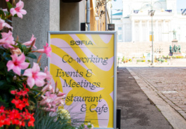
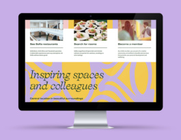
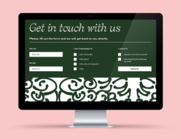
The abstract hand-drawn patterns, inspired by the decorative details of Sofia’s architecture, bring personality and character to the identity.
